Blog

  • Custom Halloween Party Invitations That Actually Get RSVPs

    Custom Halloween Party Invitations That Actually Get RSVPs

    Why Custom Halloween Party Invitations Matter More Than You Think

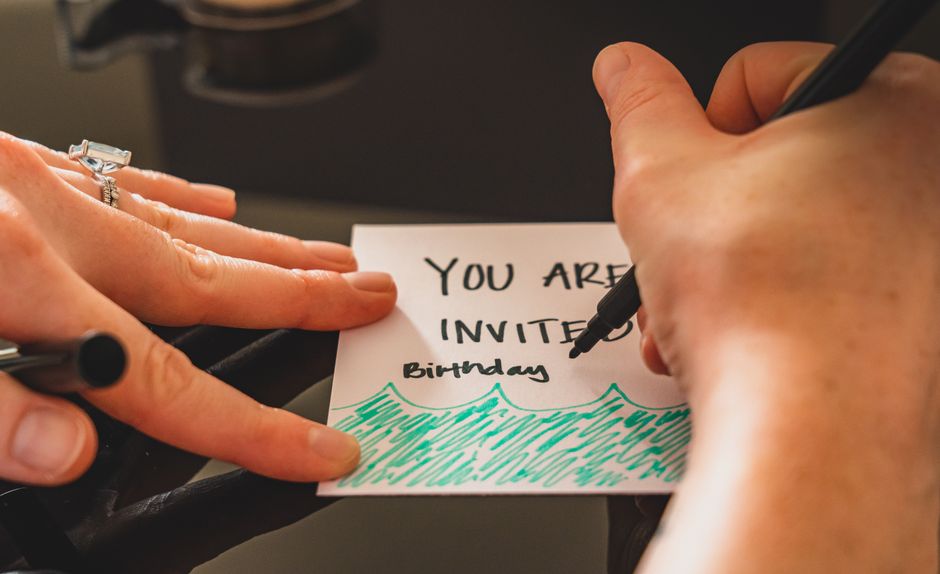
    Here’s the thing about Halloween parties: people get a ton of invites. Email, text, a casual mention at work. Your invitation needs to stand out enough that someone actually marks their calendar and shows up.

    Custom Halloween party invitations do that. They signal that you put thought into your event. They set the tone. They make people excited.

    What Makes an Invitation Feel Custom

    Custom doesn’t mean complicated. It means the invitation actually reflects your specific party.

    You get to choose your colors. Your wording. Your vibe. If your Halloween party is a sophisticated cocktail thing, your invitation should look like that. If it’s a chaotic costume contest in your basement, the invitation should feel chaotic and fun.

    The Elements You Can Personalize

    • All the text. Party time, location, dress code, RSVP details. Make it yours.
    • Color palette. Stick with classic orange and black, or go moody purple and deep teal, or neon bright.
    • Spooky design elements. Pumpkins, ghosts, witches, bats, skulls. Pick what matches your energy.
    • Photos. Add a picture of your crew in costume from last year, or a detail shot of your decorations.
    • Font choices. Playful and rounded or elegant and thin. It all communicates something about your party.

    When to Send Custom Halloween Party Invitations

    Timing matters. Send too early and people forget. Send too late and they’ve already committed to other plans.

    Aim for 3 to 4 weeks before your party. For Halloween on October 31st, that means sending invitations by early to mid October at the latest.

    Your Timeline Matters

    Think about it like this: you need time to order or print physical invitations, people need time to actually receive them, and you need time to follow up with anyone who hasn’t responded.

    If you’re going digital, you can send a bit later. But honestly, even digital invitations benefit from that 3 to 4 week window.

    Set an RSVP deadline about 2 weeks before the party. That gives you enough time to buy the right amount of candy, prep the right amount of food, and know how much space you’re actually dealing with.

    Physical vs. Digital: Pick Your Format

    custom Halloween party invitations

    Both work. It depends on your crowd and your vibe.

    Printed Invitations

    There’s something about holding a real invitation in your hand that digital just can’t match. People take it seriously. They remember it. It sits on their desk or fridge and reminds them.

    Printed custom Halloween party invitations work especially well if your guest list is relatively small or if you’re doing a more upscale event.

    Order early so they arrive with plenty of time. Mail them and account for delivery. Then follow up with a text or email to confirm people got them.

    Digital Invitations

    Email and digital downloads are fast and easy. Send them instantly. No waiting for printing or shipping.

    The downside is they’re easy to ignore. An email sits in an inbox. A text might get buried. You’ll definitely need to send reminders.

    Digital also works great if you have a huge guest list or if you’re throwing together a last-minute party and don’t have weeks to plan.

    Casual vs. Formal: Match Your Party Style

    Your invitation should look like the actual party you’re throwing.

    Go Casual and Fun

    Block letters, bright neons, playful language, cartoon-style spooky stuff. Use this for backyard parties, office Halloween events, costume contests, anything where the vibe is laid-back and silly.

    Your copy can be conversational. “Come get candy and judge our terrible costumes.” That works.

    Go Elegant and Sophisticated

    Refined fonts, muted color palettes, subtle spooky touches (like a single elegant bat or minimal pumpkin illustration). Use this for cocktail parties, dinner parties, or anything where people are actually dressing up.

    Your copy stays polished. “Please join us for an evening of elegantly spooky celebration.” See the difference?

    Design Tips That Actually Work

    You don’t need to be a designer to make a custom invitation look good. Some basics go a long way.

    Keep It Readable

    Use enough contrast between text and background. Dark text on light background or light text on dark background. Skip weird color combos that make people squint.

    Your font size should be large enough to actually read. This isn’t the place to get clever with tiny 8 point text.

    Less Is Actually More

    One or two design elements work better than ten. A cool pumpkin illustration or a spooky border. Not both plus bats plus skulls plus seventeen different fonts.

    White space is your friend. It makes the invitation feel intentional and clean, not cluttered.

    Include All the Details

    Date, time, location, what to wear, RSVP deadline, how to RSVP, your contact info. Make it impossible to miss anything.

    If there’s a theme, say it clearly. “Come as your favorite horror movie character” is clearer than “wear a costume, maybe?”

    Where to Get Custom Halloween Party Invitations

    custom Halloween party invitations

    You’ve got options here. Some people use online templates and customize them. Some order from a stationery company. Some design something custom.

    At Blue Stationery, we design custom invitations that actually reflect your personality and your party. Whether you want something playful and bright or moody and sophisticated, we can create Halloween party invitations that get people excited.

    You can browse designs, customize text and colors to match your event, and order exactly what you need. Check out bluestationery.com to see what’s available.

    After You Send Them

    The work doesn’t stop when you hit send or drop them in the mail.

    Give it a week, then follow up. If you printed and mailed, send a quick text to confirm people got them and ask for RSVPs. If you went digital, send a reminder email about a week before the party.

    People are flaky. A gentle reminder actually works. “Hey, just confirming you’re coming to the Halloween thing on the 30th?” gets results.

    Quick FAQs

    How far in advance should I order custom Halloween party invitations?

    Order at least 3 to 4 weeks before your party. That gives you time to design or customize, receive them if they’re printed, and mail them to your guests with enough notice to RSVP.

    Can I include photos on custom Halloween party invitations?

    Absolutely. Adding a photo of your crew in costumes or a detail of your Halloween decorations makes the invitation more personal and gets people excited about the actual event they’re coming to.

    What if I’m planning a Halloween party but want to use the invitations for other seasons?

    Some design elements are year-round flexible. A minimalist black and orange color palette or elegant spooky borders can work for fall gatherings beyond Halloween, and you can absolutely adapt them for other celebrations later.

    Should I ask for costume details on the invitation?

    If you have a theme or dress code, definitely include it. Something like “Come as a character from your favorite book” or “Costume required” helps set expectations and makes sure everyone’s on the same page about how dressed up (or silly) to get.
  • Best Modern Floral Wedding Stationery Suite for 2026

    Best Modern Floral Wedding Stationery Suite for 2026

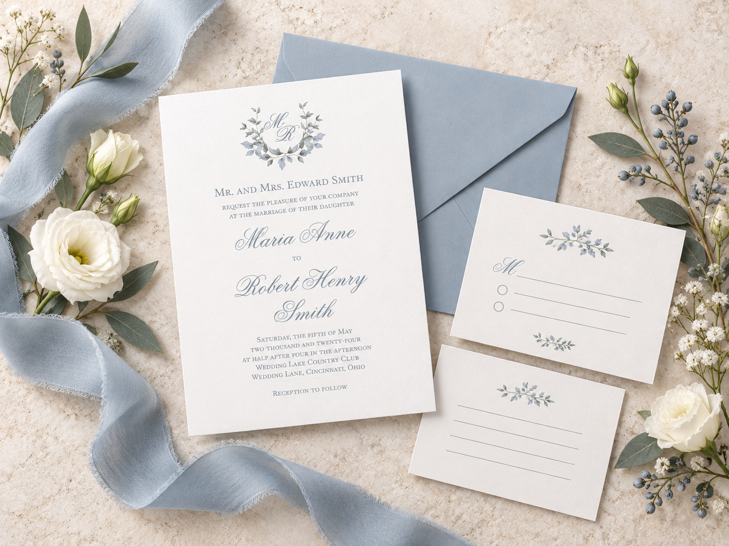
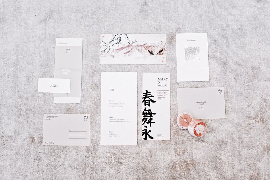
    Your wedding stationery is the first impression your guests will have of your celebration. When you choose a modern floral wedding stationery suite, you’re not just sending an invitation—you’re creating a moment that sets the mood, reflects your style, and makes your guests feel genuinely welcomed to something special.

    The challenge is finding a suite that actually comes together as a cohesive package. Mismatched cards, generic designs, and pieces that don’t feel like “you” can make the whole experience feel disconnected. But when you start with a coordinated suite, everything works in harmony. Your invitation, RSVP card, and enclosures tell one beautiful story before anyone even arrives.

    Let’s walk through how to choose a modern floral wedding stationery suite that feels authentic to your vision.

    Start With Your Theme, Not Just Pretty Flowers

    Before you fall in love with a specific floral design, identify the mood you want to create. Are you drawn to bold, contemporary florals that make a statement? Or do you prefer softer, watercolor blooms with a timeless elegance? Your theme becomes the anchor for every decision that follows.

    Modern floral design can mean different things. A minimalist geometric approach with single statement blooms reads very differently from a lush, garden-inspired layout with layered botanicals. Neither is “better”—it’s about which one makes you feel excited when you imagine your guests opening the envelope.

    Once you know your direction, every component of your suite becomes easier to evaluate. The invitation sets the stage, but it’s the RSVP card, enclosure cards, and any additional pieces that reinforce that theme and create the unified experience your guests will remember.

    Understanding Suite Components and Dimensions

    A complete modern floral wedding stationery suite typically includes your invitation cards, response cards, and enclosure cards—all coordinated in design and layout. You might also include thank-you notes or menu cards, depending on your event style.

    Standard invitation dimensions are 5″ x 7″, which is a comfortable size to hold and display on a mantel or refrigerator. This size works beautifully with floral designs because it gives you enough space to showcase your pattern without overwhelming the text.

    The key is ensuring every piece in your suite follows the same design language. Your RSVP card should echo the floral elements and color palette from your invitation. Enclosure cards—like directions, accommodations, or wedding weekend details—should coordinate seamlessly. This consistency is what transforms separate cards into a unified package that feels intentional and polished.

    When you’re evaluating a suite, check whether all the pieces are designed to work together, not just printed in the same colors. The best modern floral stationery suites use pattern, typography, and layout to create genuine harmony across every card.

    Design Flexibility: Boldness Versus Timelessness

    One of the strengths of modern floral design is how versatile it can be. A bold, contemporary floral suite might feature vibrant colors, clean lines, and asymmetrical layouts that feel fresh and fashion-forward. These designs work especially well if your wedding has a creative, artistic, or unconventional vibe.

    On the other end of the spectrum, watercolor florals offer a softer, more romantic aesthetic that still feels current and sophisticated. Watercolor blooms have a hand-painted quality that reads as thoughtful and elegant without leaning too far into traditional territory.

    The beauty of choosing a cohesive suite is that this design flexibility allows you to stay true to your personal style without worrying about whether individual cards will clash. Blue Stationery creates suites where every element supports the overall mood, so you can choose boldness or elegance knowing the entire package will deliver that feeling consistently.

    Customization Options That Make It Yours

    modern floral wedding stationery suite

    A modern floral wedding stationery suite becomes truly special when it’s personalized to your unique celebration. Look for options to customize colors, text, and layout without breaking the design integrity of the suite.

    Many couples worry that customization will feel complicated or will result in something that looks amateur. The solution is working with a suite where customization is built into the design process. Your names, wedding date, and specific details should integrate seamlessly into the existing floral pattern and typography, not feel tacked on.

    Think about which elements matter most to you: the colors, the specific flowers, the style of your names on the invitation, or the information hierarchy on your RSVP card. When you’re clear on your priorities, you can communicate them easily and get results that feel genuinely personal rather than generic.

    Why Multi-Card Coordination Actually Matters

    It’s tempting to think of your wedding invitation as a standalone piece. But your guests will see it alongside your RSVP card, any enclosures, and eventually your thank-you notes. Each piece is a touchpoint in the experience you’re creating.

    When these pieces work together as a unified suite, they signal care and intentionality. Your guests notice. They might not consciously say, “Oh, these cards are coordinated,” but they’ll feel the thoughtfulness. A cohesive suite makes your celebration feel elevated and organized before the event even starts.

    Modern floral suites are especially effective at this because florals are naturally forgiving. A repeating floral motif or pattern can appear in different ways across your invitation, RSVP card, and enclosures without feeling repetitive. The flowers anchor the suite visually while allowing each card to have its own function and personality.

    If you’re ready to move forward, explore modern floral wedding stationery suites that give you real options for customization and coordination. The goal is a suite that makes you excited every time you think about it.

    Choosing and Ordering Your Suite

    Once you’ve narrowed down your design direction, review what’s included in your suite and what you might want to add. Some suites come with just invitation and RSVP cards. Others include multiple enclosure options or additional pieces like table cards or menu cards.

    Make sure you understand how customization works before you commit. Ask whether you can see a proof, what revisions are included, and how far in advance you need to place your order. Wedding stationery typically needs to be ordered with enough lead time to ensure quality printing and delivery before your invitations go out.

    Consider your budget for the entire suite, not just the invitation cards. A beautiful invitation matters, but response cards and enclosures contribute to the overall impression. When you invest in a coordinated suite, you’re getting multiple touchpoints of design value, not just one piece.

    The final step is ordering with confidence. Look for a vendor who can deliver exactly what you’ve envisioned and who makes the process straightforward. Your stationery should feel like a joy to send, not a source of stress.

    Frequently Asked Questions

    modern floral wedding stationery suite

    What makes a floral design feel “modern” rather than traditional?

    Modern floral design typically uses a cleaner layout, more intentional use of white space, and often combines florals with geometric elements or contemporary typography. Traditional floral design might be more densely patterned or ornate. Modern doesn’t mean minimal, though—it can include bold colors and saturated blooms. It’s more about the overall aesthetic feeling current and design-forward rather than nostalgic.

    Can I customize colors in a floral suite without making it look wrong?

    Yes, absolutely. A well-designed suite will have enough flexibility built in that you can shift colors to match your wedding palette without losing the design’s integrity. The key is choosing a suite where color is secondary to the structure of the design. Ask whether the vendor offers color options or can adjust the palette for you.

    How many cards should my suite include?

    At minimum, you need an invitation card and an RSVP card. Most couples also include at least one enclosure card for additional details like directions, accommodations, or wedding weekend schedule. Some suites include thank-you cards to match. Consider what information your guests need and whether you want matching thank-you stationery, then build your suite accordingly.

    When should I order my modern floral wedding stationery suite?

    Ideally, order 8 to 12 weeks before you plan to mail invitations. This gives you time for any design revisions, ensures quality printing, and guarantees delivery with a comfortable buffer. If your wedding is coming up quickly, ask whether rush options are available, though these may affect your timeline or pricing.

  • Personalized Save the Date Cards: Design & Order Guide

    Personalized Save the Date Cards: Design & Order Guide

    Personalized save the date cards are your first impression on guests, so they deserve real thought. The good news? You don’t need design experience or a printing company to create something that feels authentically yours.

    These cards go out before your formal invitations to give people time to block off their calendars. When they’re personalized with your photos, colors, and style, they set the whole vibe for your celebration. Let’s walk through how to design them, what makes them special, and how to get them printed without the stress.

    What Makes Personalized Save the Date Cards Different

    A personalized save the date card isn’t just a generic cardstock with your date printed on it. It’s a custom design that reflects your personality and the mood of your event.

    You can add your favorite engagement photos, choose fonts and colors that match your wedding theme, include custom illustrations, or even add inside jokes that make guests smile. The customization happens through online design tools that don’t require any technical skills.

    The biggest difference? Your guests will remember these cards because they feel handmade and intentional, even though they’re professionally printed. That personal touch stays with people.

    How to Design Your Personalized Save the Date Cards

    Most online stationery retailers offer fully-customizable templates. Here’s the typical process:

    • Browse designs that match your style and event type
    • Choose a template that resonates with you
    • Upload your own photos or select from included graphics
    • Edit text, colors, and fonts using simple online tools
    • Add guest names or leave it generic
    • Preview your design before ordering

    You don’t need Photoshop or any design software. The customization happens in your browser, and most services let you make changes instantly without waiting for a designer.

    If you want to explore what’s possible before committing, Blue Stationery offers free custom samples so you can see the actual quality and appearance of your cards before placing a full order.

    Design Tips for Save the Date Cards That Stand Out

    Keep it readable. Your date, time, location, and RSVP info need to be crystal clear. Don’t let decorative elements overwhelm the essential details.

    Choose photos that tell your story. Engagement photos, photos of the venue, or candid moments of you and your partner work better than overly posed shots. One strong photo usually beats a collage.

    Stick with a color palette. If your wedding colors are navy and blush, use those colors on your save the date. Consistency makes everything feel cohesive when the formal invitation arrives later.

    Use readable fonts. Script fonts look pretty, but make sure your date isn’t hidden in decorative lettering. Your guests need to actually be able to read when you’re getting married.

    Consider the back of the card. Some people leave it blank, but you could add a small graphic, a line of text, or even the date repeated as a subtle background element. It’s a small detail that feels finished.

    Personalization Options That Actually Matter

    personalized save the date cards

    Photo personalization is the most popular choice. Whether it’s your engagement photo, a picture from your favorite trip together, or a candid moment, adding a personal image makes the card yours immediately.

    Text personalization goes beyond just your names and date. Some couples add a fun tagline like “Save the date (and your sanity)” or a meaningful quote. Others include wedding weekend hashtags or a line about what to expect.

    Custom details can include your initials, a monogram, the venue name, or special symbols that mean something to you. The more specific these details are to your story, the more memorable the card becomes.

    You can also personalize envelopes by having guest addresses printed directly on them, which saves you hours of handwriting and looks polished.

    When to Send Personalized Save the Date Cards

    Timing matters. Save the date cards typically go out 6 to 8 weeks before your event. This gives guests enough time to arrange travel and childcare without forgetting about your event before the formal invitation arrives.

    For destination weddings or events during peak travel seasons, send them earlier, sometimes 3 to 4 months out.

    Your formal wedding invitation usually comes 6 to 8 weeks before the event. The save the date gets people thinking about it first, then the invitation asks for their RSVP with all the details.

    Ordering and Quality Assurance

    Once your design is finalized, most services offer a free sample so you can verify the color accuracy, cardstock feel, and print quality before ordering your full batch. This step is worth taking because what looks good on screen sometimes prints differently than expected.

    Order enough copies for your guest list plus extras for last-minute additions and mistakes. Most people order about 10 percent more than their actual guest count.

    Standard cardstock is typical for save the date cards, but you can usually upgrade to premium cardstock if you want something heavier and more luxurious. The upgrade is worth considering since guests hold these cards in their hands.

    When you’re ready to move forward, Blue Stationery offers award-winning designs with customization options and free samples, so you can see exactly what you’re ordering before committing to the full batch.

    Envelope and Shipping Considerations

    personalized save the date cards

    Most retailers offer free guest address envelope printing, which is huge. Instead of hand-addressing envelopes, you can have them printed directly, and they arrive ready to send.

    Check whether shipping is included or if there’s a flat rate. Some services offer free or discounted shipping on orders over a certain amount.

    Plan your timing so cards arrive at least a week before you plan to mail them. This gives you breathing room if there are any issues and lets you add a personal touch like hand-written notes or wax seals if you want them.

    Common Questions About Personalized Save the Date Cards

    Do I need to use a professional designer?

    No. Online customization tools are designed for people without design experience, and templates are created by professional designers. You just pick one you love and make it your own. If you want help, some services offer design consultations, but it’s absolutely optional.

    Can I add multiple photos to my save the date card?

    Yes, but be strategic. A single strong photo usually has more impact than a collage. If you do use multiple photos, keep them in a cohesive layout so the card doesn’t feel cluttered. Templates usually show you what works before you upload anything.

    What if I want to change my design after I’ve customized it?

    Most services let you make changes to your template before you place a final order. Once you’ve ordered and the cards are printed, changes aren’t possible. That’s why free samples are so valuable, they let you confirm everything before committing.

    Can I use digital save the date cards instead of printed ones?

    Absolutely. Digital versions work great for casual events, informal gatherings, or when you need to send them quickly. Printed cards feel more special and formal, though, so choose based on your event’s vibe and your guest list’s preferences.

  • Watercolor Thanksgiving Table Decorations: 5 Easy Ideas

    Watercolor Thanksgiving Table Decorations: 5 Easy Ideas

    Watercolor Thanksgiving table decorations are the perfect way to add warmth and personality to your holiday gathering without needing a ton of materials or stress. Watercolor artwork has this effortless, organic feel that works beautifully with fall’s natural color palette, and when you layer it with simple greenery, candles, and linen, you create a table that looks thoughtfully designed but still relaxed and inviting.

    Let’s walk through how to bring this look together, starting with the easiest pieces and building up to a full tablescape.

    Start with Watercolor Place Cards

    Place cards are your foundation. They set the tone for everything else on the table and give your guests that immediate sense that this meal is special and personal.

    Hand-painted watercolor place cards are the simplest element to DIY or commission. You can use warm autumn hues like burnt orange, deep gold, soft rust, and cream. Paint simple washes of color across cardstock, let them dry, and add names in a clean script or handwritten font.

    If painting isn’t your thing, Blue Stationery offers pre-designed watercolor place card templates and printed options so you get that custom look without the extra work. You can personalize them with each guest’s name and adjust colors to match your fall palette.

    Pro tip: make the place card design a craft activity with your kids the afternoon before Thanksgiving. They can paint simple leaf shapes or color blocks, and suddenly everyone at the table has invested in the meal before it even starts.

    Build Your Color Palette Around Watercolor Accents

    The beauty of watercolor is how it softens hard lines. Instead of bold, graphic color blocks, watercolor creates these gentle transitions between warm fall tones.

    Start with 3-4 core colors that appear in your watercolor elements. Burnt orange, sage green, cream, and soft gold work beautifully together. Then pull those same colors into your linens, candles, and table runners. If your place cards feature a watercolor blend of orange and gold, choose napkins in a solid cream or soft gold to echo those tones without competing for attention.

    Natural textures amplify this vibe. Pair watercolor place cards with kraft paper menus or a simple linen table runner in cream or warm taupe. Add dried pampas grass, wheat stems, or branches in a low vase down the center of the table. The watercolor accents feel like they belong in nature rather than clashing against it.

    Design a Watercolor Menu or Table Runner

    Once you’ve locked in your place cards, think about secondary printed pieces that extend the watercolor theme.

    A watercolor menu card at each place setting reinforces your design direction and gives guests something beautiful to look at while they wait for food. Paint a simple horizontal wash of your fall colors across the top third of the card, add your menu items below in clean type, and you’re done.

    Alternatively, commission a watercolor table runner design that can be printed on kraft paper or linen. A runner with soft watercolor leaves or an abstract wash in your core colors ties the whole table together and anchors your centerpieces.

    If custom printing feels like too much, even a simple printed watercolor design from Blue Stationery can be scaled to fit a runner, menu, or accent card. You control the colors to match your exact vision, and you get a polished, coordinated look without months of planning.

    Layer in Greenery and Natural Elements

    watercolor Thanksgiving table decorations

    Watercolor and nature go hand in hand. This is where your tablescape gets dimension and depth.

    Gather branches, eucalyptus, dried grasses, or fresh greenery from your yard or a local florist. Arrange them loosely in low vessels (think bud vases or small jars wrapped in kraft paper) spaced down the table’s center. The informal, flowing nature of branches complements the soft edges of watercolor perfectly.

    Add unscented or lightly scented candles in cream or soft gold around these arrangements. The candlelight will catch the watercolor accents on your place cards and make the whole table feel warm and gathered.

    Skip anything too matchy or formal. Thanksgiving is about abundance and generosity, not perfection. If your greenery arrangement is a little wild or your candles are different heights, that’s exactly right.

    Add Watercolor Illustrations or Artwork

    Here’s a high-impact, low-effort move: frame a simple watercolor illustration or print and place it as a focal point on a side table or buffet nearby.

    A 5×7 or 8×10 watercolor of autumn leaves, a harvest scene, or an abstract blend of fall colors sets a visual mood for the whole meal space. You can commission this from an artist, download a digital file and print it yourself, or find pre-designed options that match your color story.

    Prop it in a simple frame and it feels intentional and curated without taking up table space or requiring any maintenance during the meal.

    Keep It Budget-Friendly

    The beauty of this approach is that you don’t need expensive florals, custom linens, or elaborate centerpieces to pull off watercolor Thanksgiving table decorations.

    Your main expenses are printed place cards and perhaps one menu or runner design. Everything else comes from things you already have: candles, branches, small jars or vessels, linens in your existing fall colors. Even if you commission custom watercolor designs from a stationery brand like Blue Stationery, the per-piece cost is usually low enough that it feels like a worthwhile investment for a seasonal table that will be admired and remembered.

    The real value is in the thoughtfulness and coherence. Your guests will notice that the table feels curated and that each element connects to the others. That’s what makes a meal feel special, not how much you spent.

    Personalization That Feels Natural

    watercolor Thanksgiving table decorations

    One last thought: watercolor invites personalization without feeling overdone. You can add initials to place cards, paint each guest’s name in their favorite fall color, or commission a custom design that nods to a meaningful symbol or memory your family shares.

    This is where stationery becomes more than decoration. It becomes part of the gathering itself. Your guests sit down, see their name painted in soft watercolor, and immediately understand that this meal was made with intention, just for them.

    Whether you design and print these pieces yourself or work with Blue Stationery to create custom watercolor Thanksgiving table decorations, the key is starting with one strong element (place cards) and building outward from there. You’ll end up with a table that looks cohesive, feels warm, and tells the story of your family’s Thanksgiving.

    Can I make watercolor place cards the day before Thanksgiving?

    Absolutely. Watercolor dries quickly, usually within 30 minutes to an hour depending on how wet you apply it. Paint your place cards the day before, let them dry completely overnight, and add names on Thanksgiving morning. This gives you one less thing to stress about on the actual day.

    What if I’m not a good painter? Can I still do watercolor place cards?

    Yes. Watercolor is forgiving because it’s meant to be loose and organic. Even messy washes and uneven color blends look intentional and artistic. If painting still feels too intimidating, you can order pre-printed watercolor designs and just hand-write the names, or find digital templates online to print at home.

    How many watercolor elements do I need for a cohesive table?

    At minimum, place cards. They’re the only watercolor element that’s truly necessary. Everything else builds from there. If you add a menu card or one printed table runner, you’ve created a really coordinated look without overdoing it. Three to four coordinating pieces (place cards, menu, runner, and maybe a small framed print) is ideal for a polished, intentional feel.

    Where can I find watercolor Thanksgiving design templates?

    Many stationery retailers and design sites offer printable templates. Look for keywords like “watercolor place card template” or “fall tablescape design.” You can also work with a custom designer to create something unique to your color palette and style preferences, which is often more affordable than you’d expect for personalized, high-quality stationery.

  • Minimalist Wedding Invitation Designs: Clean & Elegant Ideas

    Minimalist Wedding Invitation Designs: Clean & Elegant Ideas

    Minimalist wedding invitation designs strip away the clutter and focus on what truly matters: beautiful typography, intentional white space, and a handful of carefully chosen design elements. If you’re drawn to modern, understated elegance and want your invitations to feel as refined as your wedding day will be, this approach delivers exactly that.

    The beauty of minimalism in wedding invitations is that less really does mean more. A clean layout with strategic negative space draws the eye exactly where you want it and makes your guests feel like they’re receiving something thoughtfully designed, not mass-produced.

    What Makes Minimalist Wedding Invitations Stand Out

    Minimalist design is defined by simplicity, but that doesn’t mean boring. Here’s what separates a truly elegant minimalist invitation from one that just looks empty:

    • Limited color palette: Think neutral tones like cream, black, gray, or soft beige. Some designs add a single accent color or use a refined metallic detail.
    • Strong typography: Your font choice becomes the star. A high-quality, distinctive typeface does the heavy lifting in a minimal design.
    • Generous white space: This is intentional breathing room. It’s not laziness; it’s strategy. White space makes text easier to read and creates a sense of luxury and calm.
    • Strategic details: Monograms, subtle line work, small florals, or a single graphic element add personality without cluttering the design.
    • Quality materials: Minimalist invitations feel best on premium paper stock. The simplicity of the design means the quality of the paper itself becomes part of the aesthetic.

    Designing Your Minimalist Wedding Invitation Suite

    A cohesive invitation suite extends your minimalist aesthetic across every piece: save the dates, response cards, detail cards, and thank you notes. This consistency reinforces your design vision and gives your guests a unified experience.

    Start with your main invitation card. Decide what information is absolutely essential: your names, the date and time, the location, and how to RSVP. Everything else is optional. Pare it down to just those core details, then arrange them with plenty of breathing room on the page.

    Next, choose your typography. In minimalist design, your typeface choice is crucial because it’s often the only decorative element. A modern sans-serif feels contemporary. A refined serif has a timeless, elegant quality. A single well-chosen font often works better than mixing multiple typefaces, though pairing a display font with a clean secondary font can work beautifully when done with restraint.

    For color, consider your wedding’s overall aesthetic. Neutral palettes (black and white, cream and gray, navy and white) are timeless and work with any venue or season. If you want to introduce color, use it sparingly. A single accent color on an accent card, or a subtle colored cardstock paired with black text, can add visual interest without abandoning minimalist principles.

    If you’d like professional guidance on bringing your vision to life, Blue Stationery specializes in custom-designed minimalist invitations that balance simplicity with personality.

    Popular Minimalist Design Details to Consider

    While the core of minimalism is simplicity, a few subtle details can elevate your invitations and add a touch of your personal style:

    • Monograms: A single monogram or your initials personalize the design without adding clutter. Place it quietly in a corner or at the top of the card.
    • Subtle line work: A thin line or simple geometric shape can frame your text or add a delicate accent without overwhelming the design.
    • Neutral greenery: Minimal botanical accents, like a single leaf or small branch, add organic beauty while staying true to the aesthetic.
    • Scribble or hand-drawn details: A simple brushstroke or scribble detail adds a modern, artistic touch and feels personal without being chaotic.
    • Lace or crochet accents: These can work in minimalist designs when used in small doses, perhaps on a belly band or as a subtle texture element on an accent card.
    • Strategic metallic touches: Foil stamping in gold, copper, or silver on a neutral background can add luxury and visual interest while maintaining the clean aesthetic.

    Customizing Minimalist Templates for Your Wedding

    minimalist wedding invitation designs

    If you’re not commissioning a completely custom design, customizable templates are a smart starting point. They let you maintain a professionally designed minimalist framework while personalizing the details.

    When you’re customizing, stay true to the minimalist principles: keep your text concise, don’t crowd the layout with extra elements, and make sure any changes you make feel intentional, not accidental. If the template uses a particular font, stick with it rather than swapping it out for something busier. If there’s white space, respect it.

    Color customization is usually safe territory. If the template comes in black and cream, you might swap it to navy and cream or blush and gray. Just make sure your new color scheme still feels cohesive and elegant.

    The real power of minimalist design is that it feels intentional. Every element should have a reason for being there. When you customize a template, keep asking yourself: does this addition make the invitation better, or am I just adding something because the space is there?

    Making Your Minimalist Invitations Feel Personal

    A common concern with minimalist invitations is whether they’ll feel cold or impersonal. The answer is no, when designed thoughtfully. Minimalism is actually a great vehicle for personality because it forces you to choose details that genuinely matter to you.

    Your personality comes through in the typeface you choose, the colors you select, the small details you include, and the overall vibe of the layout. A minimalist invitation designed specifically for you will feel way more personal than a heavily decorated template that could be anyone’s.

    Consider adding a handwritten element: your names in calligraphy, a personal date or phrase, or even handwritten addresses on the envelopes. This human touch pairs beautifully with minimalist design and makes the invitation feel like it was created with care.

    You can also extend minimalism into your envelope design. A simple, clean envelope with elegant typography creates the perfect introduction to your invitations and signals to your guests that something thoughtful is inside.

    Paper Stock and Finishing Touches

    In minimalist design, the quality of your materials becomes even more important because there’s nothing to hide behind. Choose a premium paper stock that feels good in your hands and has a subtle texture or finish that adds tactile luxury.

    Consider these finishing options to elevate your minimalist suite without cluttering it:

    • Foil stamping (especially metallic) on premium cardstock
    • Letterpress for subtle, elegant texture
    • Textured or deckle-edge cardstock
    • A simple belly band or wax seal that coordinates with your design
    • Minimal embossing for subtle dimension

    When you’re ready to bring your minimalist wedding invitation vision to life, Blue Stationery offers professionally designed options that capture the elegance of minimalism with all the personal touches that make your wedding feel uniquely yours.

    Common Mistakes to Avoid

    minimalist wedding invitation designs

    Minimalism is easy to get wrong, but knowing what to avoid helps you nail it:

    • Don’t mistake empty for simple: Blank space should feel intentional, not accidental. There’s a difference between minimalism and just not designing anything.
    • Don’t cram too much text: Pare down your wording. Does your guest really need a paragraph of directions, or can you direct them to your wedding website?
    • Don’t mix too many fonts: Stick with one or two, maximum. Each font should serve a clear purpose.
    • Don’t use cheap paper: It undermines the entire aesthetic. Minimalism works because every element matters, including the physical feel of the piece.
    • Don’t abandon personality: Your minimalist invitation should still feel like it’s from you, not from a corporate office supply catalog.

    Bringing Minimalism Across Your Full Wedding Suite

    For the most cohesive experience, carry your minimalist aesthetic into every piece your guests receive: save the dates, main invitation, RSVP card, detail card, thank you notes, even your wedding favors if you’re including a printed element.

    This doesn’t mean every piece looks identical. A response card might use the same font and color palette but feature a subtle design variation. A detail card might include one small detail (like a line drawing or monogram) that appears quietly on the main invitation. These subtle variations create visual interest while maintaining consistency.

    When you’re planning a full suite, think of your minimalist invitation as the hero piece, and then design supporting pieces around it. Each one should reinforce your overall aesthetic without repeating the main design exactly.

    Building a complete, minimalist wedding stationery suite is easier when you start with a cohesive vision. That’s where working with a design studio like Blue Stationery makes a difference. Designers who specialize in minimal aesthetics understand how to carry your vision across multiple pieces while keeping each one feeling fresh and intentional.

    Final Thoughts on Minimalist Wedding Invitations

    Minimalist wedding invitations appeal to couples who value intentionality, quality, and timeless design over trends. They feel sophisticated without being stuffy, modern without being cold, and personal without being chaotic.

    The process of designing minimalist invitations actually feels calming because you’re not juggling dozens of elements. You’re making thoughtful choices about typography, color, space, and a handful of carefully selected details. The result is an invitation that doesn’t shout, it whispers. And that whisper is far more elegant.

    Are minimalist wedding invitations more expensive?

    Not necessarily. The cost of your invitations depends on factors like paper quality, printing method, customization, and quantity. A minimalist design might actually cost less to produce than one with lots of full-color printing, though that depends on your choices. If you’re using foil stamping or special paper, those details affect the price. The best way to understand your options is to check current pricing and customization choices directly with designers who specialize in this style.

    Can I add color to a minimalist wedding invitation?

    Absolutely. Minimalism doesn’t mean black and white. You can use any color palette as long as you keep it limited and intentional. A two-color scheme (like navy and cream, or blush and black) works beautifully. Some minimalist invitations use a single accent color, like a warm gold or soft green, introduced through foil stamping or cardstock. The key is restraint: every color choice should feel purposeful, not random.

    What font should I use for minimalist invitations?

    Choose one high-quality typeface that reflects your personal style and the formality of your wedding. A clean, modern sans-serif (like Montserrat or Futura) feels contemporary and works in most settings. A refined serif (like Garamond or Caslon) feels timeless and elegant. A script or hand-drawn font can work if it’s refined and paired with a clean secondary font, but avoid anything too trendy or decorative. The typeface is doing a lot of the aesthetic work in a minimalist design, so choose it carefully.

    Should my minimalist invitation be all one color?

    Not required, but it’s a valid approach. Some stunning minimalist invitations use a single color (like all black text on cream cardstock). Others introduce a second color through the cardstock itself or through an accent detail. A third option is to use multiple colors but in a very controlled, intentional way, like a primary color plus one accent color. There’s no single right answer, only what feels right for your wedding’s aesthetic.

  • 3 Watercolor Thanksgiving Table Ideas for a Beautiful Fall Gathering

    3 Watercolor Thanksgiving Table Ideas for a Beautiful Fall Gathering

    Thanksgiving is about gathering with the people we love, sharing a comforting meal and creating memories around the table. A thoughtfully coordinated table can make the occasion feel even more special—and it doesn’t need to be overly formal or complicated.

    Watercolor illustrations, warm autumn colors and classic gingham patterns make it easy to create an inviting Thanksgiving table. Here are three coordinated table-setting ideas featuring pumpkins and gourds, a traditional cornucopia, and a festive turkey surrounded by fall greenery.

    1. Watercolor Pumpkins and Gourds

    A fall Thanksgiving table setting with custom paper plates, napkins, and place cards. all with Happy Thanksgiving typography design. and watercolor pumpkins and gourds. together with orange gingham placemats and matching orange gingham cloth napkins.

    A pumpkin-and-gourd theme is a lovely choice for a warm and welcoming Thanksgiving celebration. Soft watercolor artwork brings seasonal color to the table without making it feel too busy.

    Begin with a watercolor pumpkin and gourd tablecloth as the foundation. Add orange gingham placemats and coordinating cloth napkins to introduce a classic farmhouse-inspired pattern. Pumpkin-themed plates and handwritten place cards complete each setting.

    For an easy centerpiece, arrange a few small pumpkins, eucalyptus stems and cream-colored candles along the middle of the table. Keep the decorations low so guests can comfortably see and talk to one another.

    SHOP THE LOOK

    2. Watercolor Cornucopia Harvest

    A fall thanksgiving table setting with a pumpkin and gourds artwork tablecloth, orange gingham pattern placemat and cloth napkins, an cornucopia artwork place card, with matching sticker.

    The cornucopia is a traditional symbol of abundance, making it especially meaningful for Thanksgiving. Watercolor fruit, pumpkins, flowers and greenery give this classic theme a softer and more elegant appearance.

    Pair a watercolor cornucopia tablecloth with orange gingham accessories to bring out the warm shades in the artwork. Add coordinating plates, napkins and place cards for a table that feels polished without being overly formal.

    A simple bowl of pears, apples and small gourds makes a beautiful centerpiece for this setting. You can also add a few sprigs of greenery to connect the centerpiece with the watercolor foliage in the design.

    If you are hosting Thanksgiving dinner, matching invitations and return-address envelopes can introduce the theme before guests even arrive.

    SHOP THE LOOK

    3. Watercolor Thanksgiving Turkey and Greenery

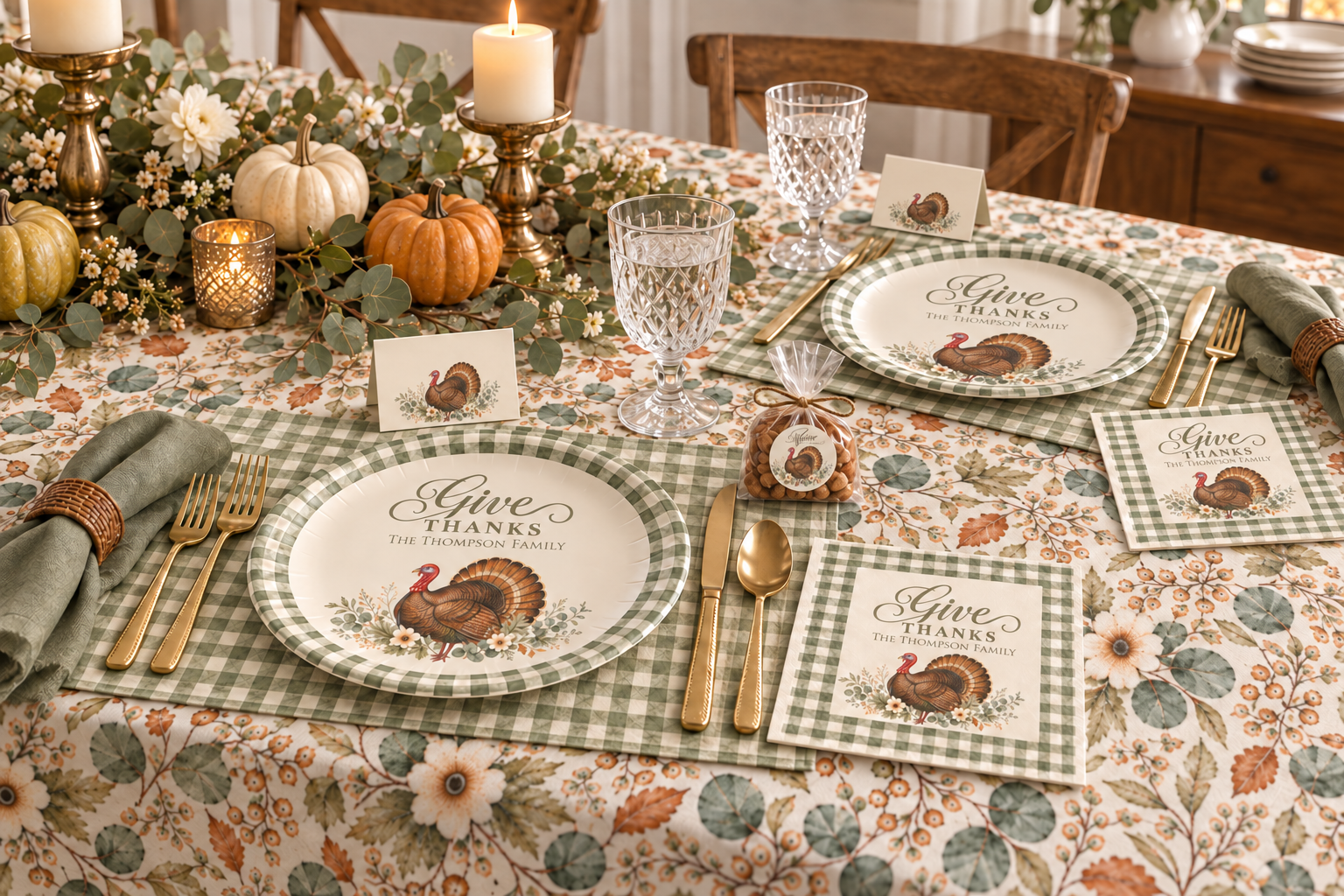
    A fall autumn themed thanksgiving table setting with a watercolor turkey place cards, stickers, paper plate, paper napkins, gingham pattern placemat and cloth napkins, as well as a floral tablecloth. with wine glasses, silverware, and candle centerpieces with autumn  pumpkins and greenery

    For a more traditional Thanksgiving table, choose a watercolor turkey design accented with elegant fall foliage. Rich autumn colors paired with soft sage green create a timeless look that works well for both casual family dinners and larger gatherings.

    A turkey-and-foliage tablecloth can be paired with green gingham placemats and napkins. Add coordinating turkey plates and place cards to carry the design across each place setting.

    Complete the table with natural greenery, pinecones, white berries and a few small pumpkins. Brass or gold-toned candleholders can add warmth while still allowing the watercolor artwork to remain the focus.

    SHOP THE LOOK

    Add Personalized Place Cards

    Place cards are a small detail that can make Thanksgiving dinner feel especially thoughtful. They help guests find their seats while adding a personalized finishing touch to the table.

    Write each guest’s name by hand using a black, dark green or warm brown pen. You can also add a short note of gratitude to the back of each card or invite guests to write something they are thankful for.

    After dinner, the cards can become small keepsakes for family and friends.

    Coordinate the Celebration Beyond the Table

    A coordinated Thanksgiving theme can extend beyond plates and linens. Matching invitations, return-address envelopes and mailing labels create a lovely first impression, while personalized stickers can be added to favor bags, dessert boxes or leftovers prepared for guests to take home.

    A Thanksgiving magnetic shopping list can also help organize ingredients, groceries and last-minute hosting tasks—and it makes a thoughtful hostess gift when paired with a ribbon or small kitchen accessory.

    You don’t need to use every matching item. Choose a few pieces that will have the greatest visual impact, such as a tablecloth, place cards and napkins, and then mix them with serving pieces and decorations you already own.

    Creating a Thanksgiving Table That Feels Like You

    Whether you prefer cheerful pumpkins, an abundant cornucopia or a traditional Thanksgiving turkey, the most memorable table is one that feels warm, welcoming and personal.

    Start with one favorite watercolor design and build the setting gradually with coordinating colors and patterns. Small details—such as handwritten names, natural greenery and softly glowing candles—can transform an ordinary table into a beautiful place for everyone to gather.

    Explore the Complete Collection.